
A bottle as the visual starting point
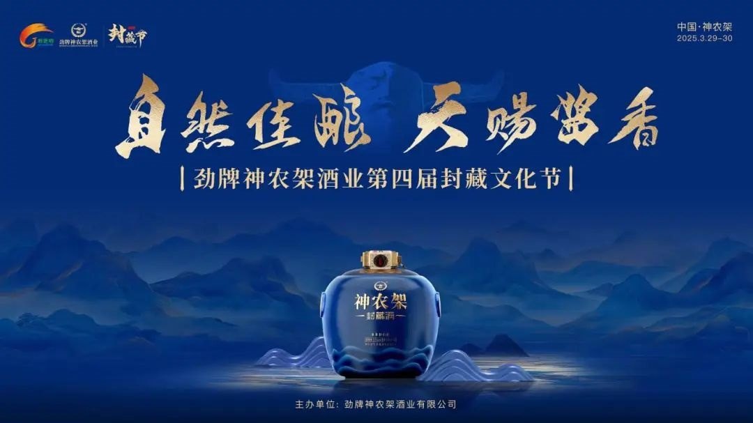
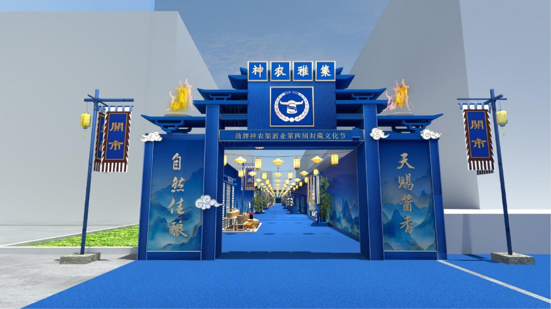
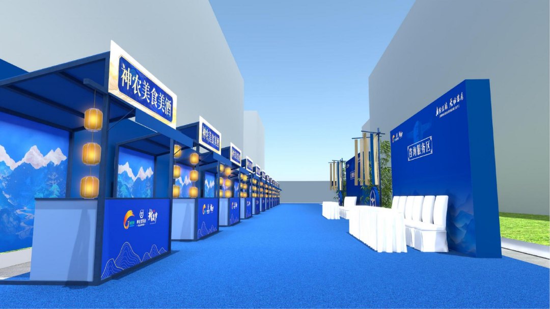
The artwork for a liquor-sealing festival can begin with the product itself. Jingpai's Shennongjia distillery took the bottle's blue as its colour reference, set the theme in gold calligraphy and added outlines of the local landscape. Each element had a reason to be there. Together they related the drink to its place and cultural message. The product's existing design became a source for the festival artwork.
The fourth edition and its audience
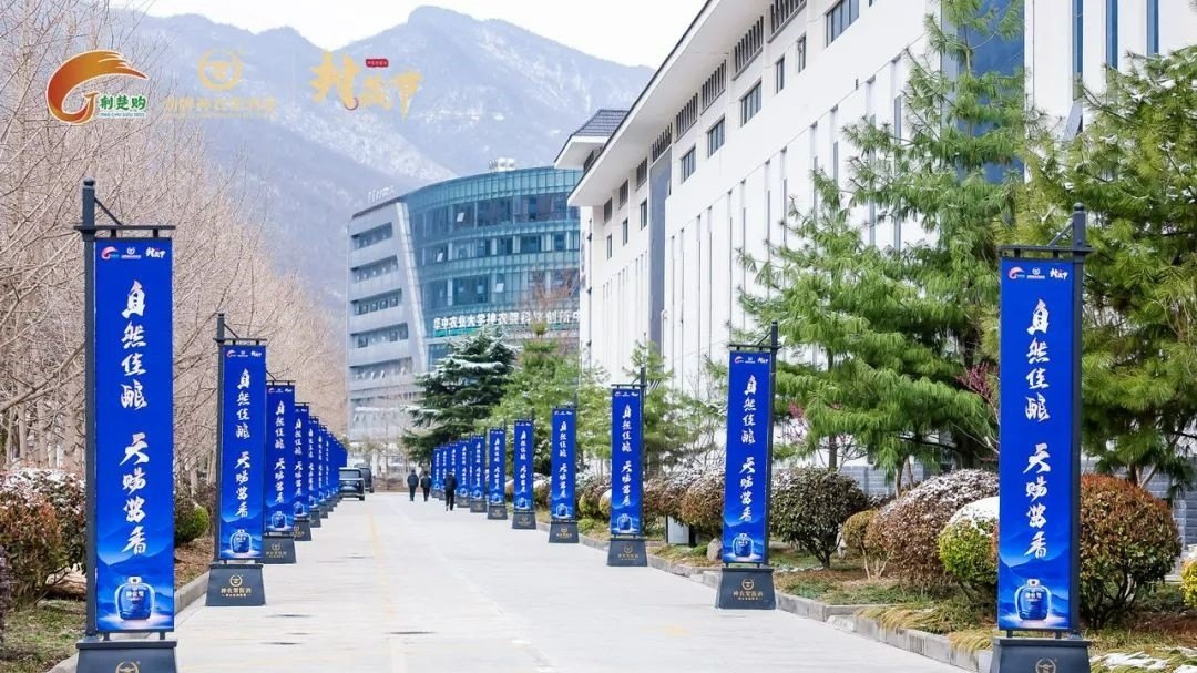
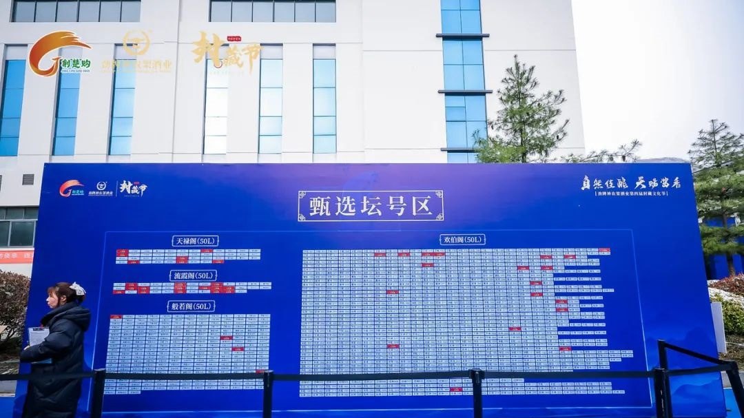
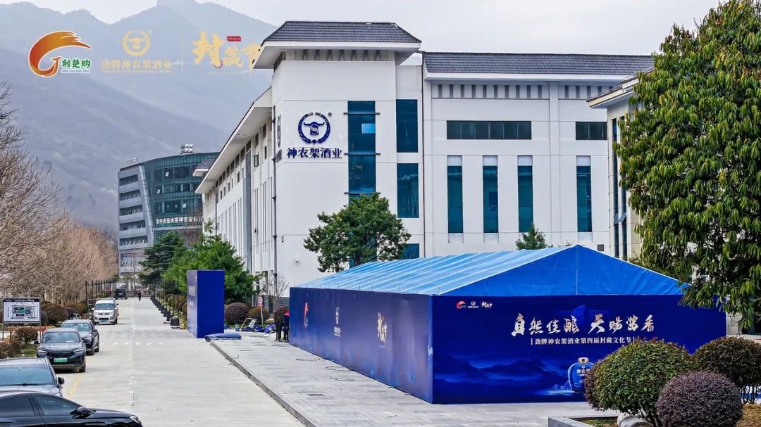
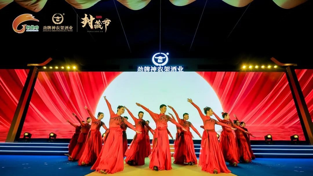
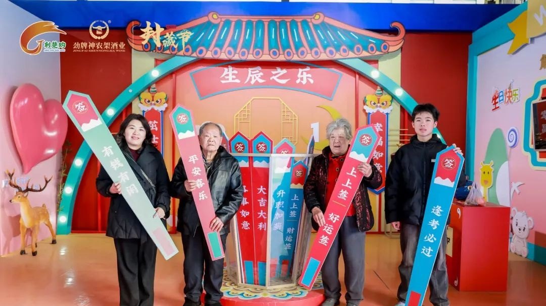
Shennongjia hosted this fourth edition on the twenty-ninth and thirtieth of March, 2025. More than fourteen hundred people participated, spanning the drinks industry, cultural circles and consumers. The occasion thus brought several kinds of audience into a shared brand-cultural setting. That context helps explain the combination of product recognition with natural imagery that different guests could readily understand.
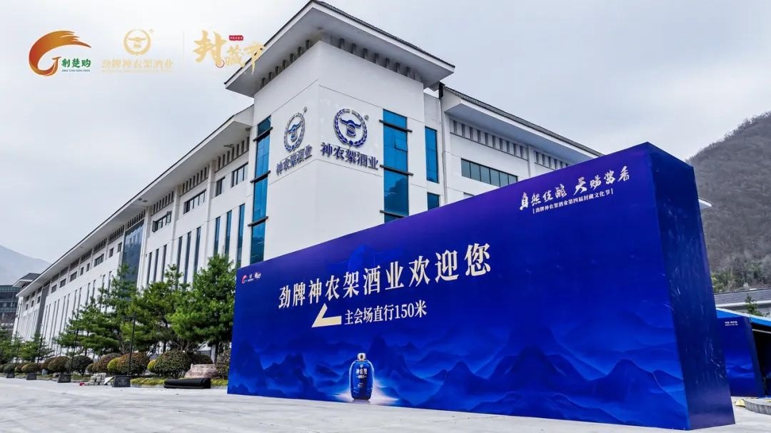
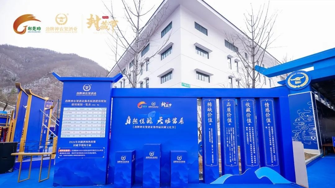
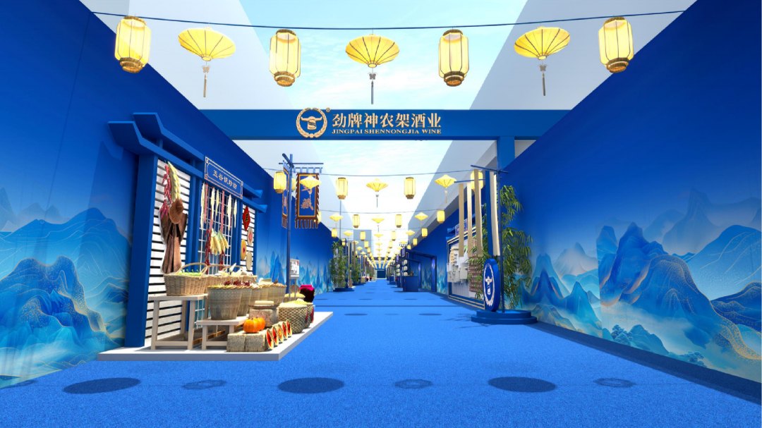
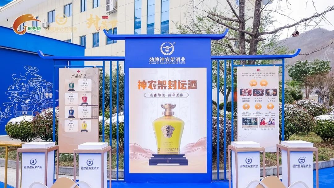
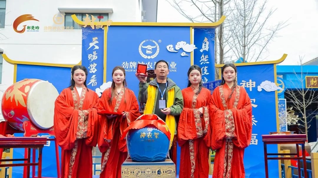
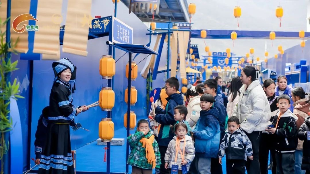
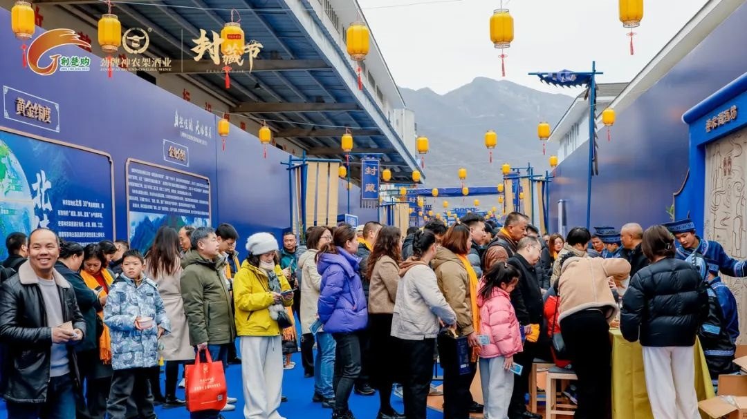
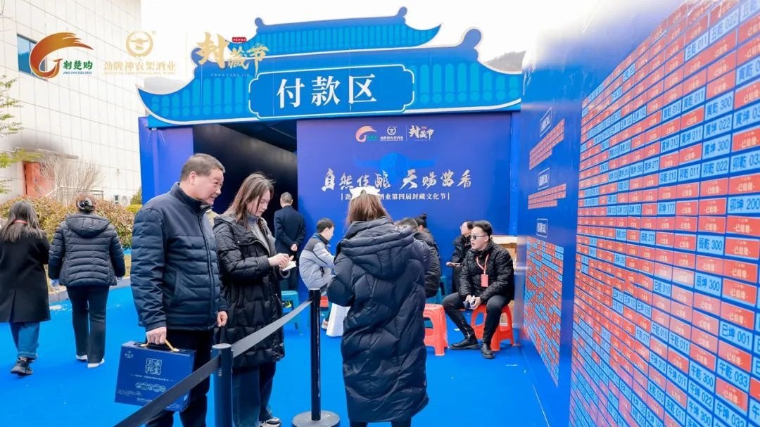
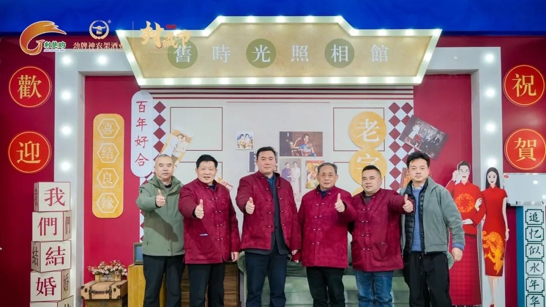
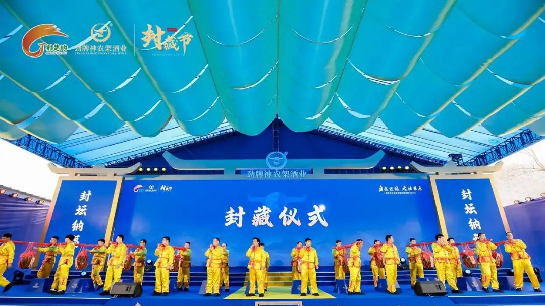
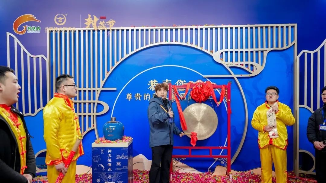
Colour identifies the product; lettering carries meaning
The deep-blue choice originated with the sealed-liquor bottle. Gold writing presented the theme, Natural Fine Brew, Heaven-Sent Sauce Aroma. Those elements performed different jobs: colour continued an existing product reference, while calligraphy made the cultural proposition readable. This is a useful way to examine how identity and language coexist in a single composition.
Landscape as a reference to origin
The hills and waters appeared as silhouettes behind the lettering, identifying Shennongjia as the place associated with the drink. Nature in the theme acquired a pictorial counterpart, while bottle-inspired colour brought the reading back to the product. Moving from that product reference toward the landscape in the background reveals the composition's layers: the liquor, its cultural message and the associated place can be understood together.